Black Sheep Kitchen
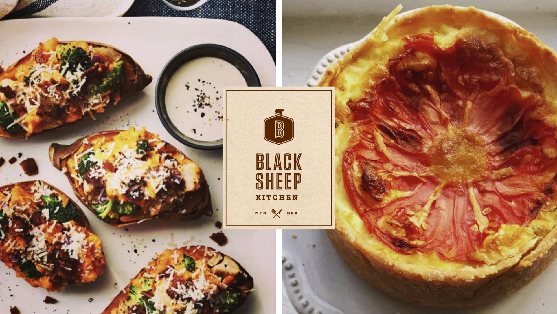
Creating classic American southern comfort food from scratch, Black Sheep Kitchen strives to make the best versions of familiar family fare with a signature twist—just like the name implies.


the brand
Black Sheep Kitchen cooks five days a week so you don’t have to. Where family is the focus, founder Julie Grimes takes traditional recipes and elevates them into healthy, mindful meals meant to be shared and savored.


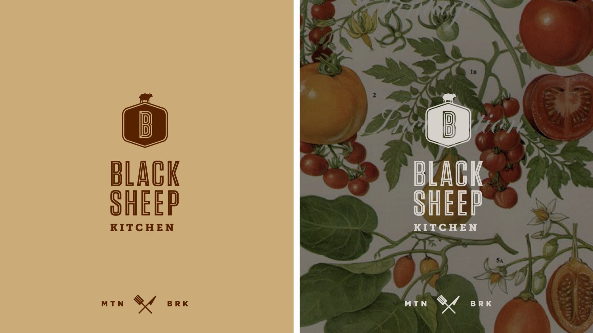
With a storied culinary background and recipes appearing in Southern Living, Cooking Light, Fine Cooking, and Women's Health, the brand needed to be as recognizable as Julie’s resumé. Everything about the logo is custom. From the black sheep icon standing atop a stylized “B” to the hand-drawn typography, the logo is as unique and approachable as Julie’s food. The cool mint green color is reminiscent of Depression glass, tying past to present, food to family, everything Black Sheep Kitchen is known for.


custom illustrations
The custom illustrations incorporate fresh seasonal produce, designed to be used year-round.


alternate logo options
The client desired to take elements from the logo options presented below to create the final mark. Custom, hand-drawn lettering and iconography were big components in crafting the end result.


